Node-RED Dashboard Tutorial
By
Community /
Developer
Aug 11, 2023
Navigate to:
This post was written by Suleiman Abubakar Sadeeq, an ambitious react developer learning and helping to build enterprise apps.
If you’re already familiar with what Node-RED is, you know how useful it is for automation. This post is going to be a guide to getting started with the Node-RED dashboard tool. This post will cover how to install the Node-RED dashboard nodes, and it’ll also provide you with some examples of how to create a graphical user interface (GUI) for your automation using some of the nodes on the Node-RED dashboard.
What is Node-RED?
Node-RED is a programming tool built on top of Node.js that provides a way to create automation with minimal code. It wires different nodes together, with each node carrying a specific function linking them to create a flow that carries out an automation task (e.g., switching off the light in a room or closing a door).
Prerequisites
We assume you’ve already installed and set up Node-RED. If that isn’t the case, here are some guides that can help you achieve that a few different ways:
Node-RED dashboard installation
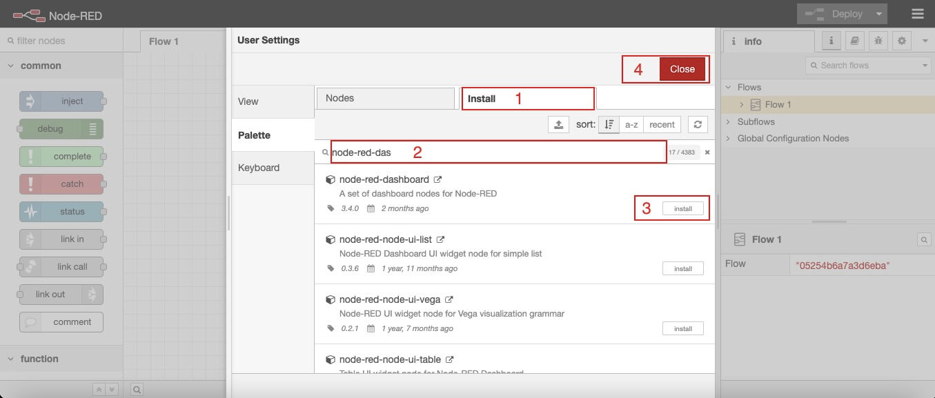
The first step in the process is installing the dashboard module in Node-RED. In the browser’s Node-RED window, click on the Menu icon at the top right corner of the page, find Manage Palette on the menu items, click Install, and search for node-red-dashboard. Install it, and make sure that the module you install reads node-red-dashboard.

After successful installation, all the dashboard nodes will appear in the palate section. Each dashboard node provides a widget that you can display on a user interface (UI) (e.g., gauge, chart, button, etc.).

Creating a user interface
Let’s walk through how to create a dashboard UI using the dashboard nodes on Node-RED.
Layout
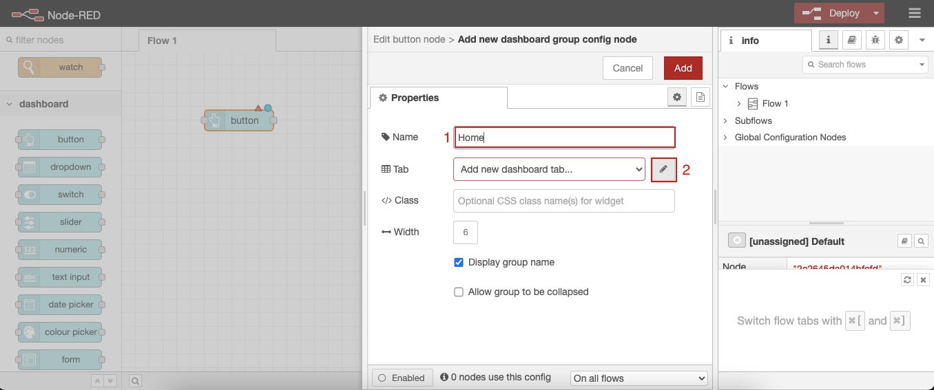
We use tabs and groups to arrange the UI in the Node-RED dashboard. Tabs in the Node-RED dashboard are pages that hold or display different groups, which separate a tab into several sections. In each group is where you organize your node widgets (buttons, texts, charts, etc). Below is a walkthrough on how to create tabs and groups.

Drag any dashboard node (in my case, a button node) into the flow and double-click on the node. A window where you can edit the node will appear. Where it says Group, click on the pencil icon next to it to add a new group. The window in the picture above will appear. Give the group a Name of your choice and click the pencil icon next to where it says Tab to add a new tab. Give the Tab a name of your choosing and click Add.

Now we have successfully created our first tab and group. The next step will be displaying something on the user interface.
Display a widget on the UI
In this example, we want to display a button that speaks out some text when clicked on.

Drag an audio node to the flow, place it next to the button node we already have in the flow, and wire them together. Double-click on the audio node and add it to the Group you created (in my case, Home). Now, do the same with the button node, but also scroll down to find the Payload setting and add a text in there. In my case, it’s Welcome, as seen in the image above. Click Done and Deploy.
To view the dashboard UI, follow this URL: http://Your_RPi_IP_address:1880/ui
Your_RPi_IP_address is the address of the Raspberry Pi machine you’re using, 1880 is the port where Node-RED is exposed, and ui displays the dashboard user interface.
If everything works fine, you’ll see the same window as the one below. You might see a light theme background. We’ll get to how I ended up with a dark theme later in the post.

More examples of widgets
Let’s create a simple example of a dashboard that has two tabs and some UI elements (widgets) in each.

To create another tab, click on the Tab button highlighted in the image above. It’ll create a new tab, just as seen in the image above as well. Once you hover over the Tab2 text (as seen in the image), you’ll see an edit button. You can follow the same procedures we followed when creating our first Tab and Group.

Once that’s done. Drag a slider, gauge, and chart node into the flow. Double-click on the slider node and edit the min and max values to be 0 and 100. Also make sure to assign it to the new tab group you just created and click Done. Repeat a similar process with the gauge and chart nodes. In my case, I added colors to the gauge for when it reaches certain values, which you’ll see in the image below. You can choose the way you want your elements to look, but I’m just trying to keep it simple for now.

Now, wire both the gauge and the chart nodes to the slider node and deploy your changes. You should see something similar to the image below. When you move the slider, you’ll notice the chart and gauge respond to it, and you’ll also notice the color difference on the gauge if you added that. If you haven’t noticed the hamburger icon in the top left corner of the page, we’ll be looking at that in the next step.

Tabs
Well, the hamburger icon is how you switch between your tabs. When you click on the menu icon, a sidebar pops out with your tabs, and you can switch between both. The first tab (Sub) contains our first example, which was a text-to-speech widget, and the second tab (Sub 2) contains the gauge and chart example.

Dashboard theme
By default, the Node-RED dashboard comes with a light theme, a light background, and a light blue navigation bar. But you can also choose a dark theme or a custom theme. It also allows editing the color of the navigation according to your preference. As you can see in the image below, I’m using a dark theme rather than the default white theme.

To edit the theme on your dashboard UI, click on the Theme tab and choose either Light or Dark according to your needs. You can also customize your own theme if you want. Click on the Colour option to change the color of the nav bar to whatever color you want. After you’re done, don’t forget to hit Deploy so you can view your changes.
Site styling
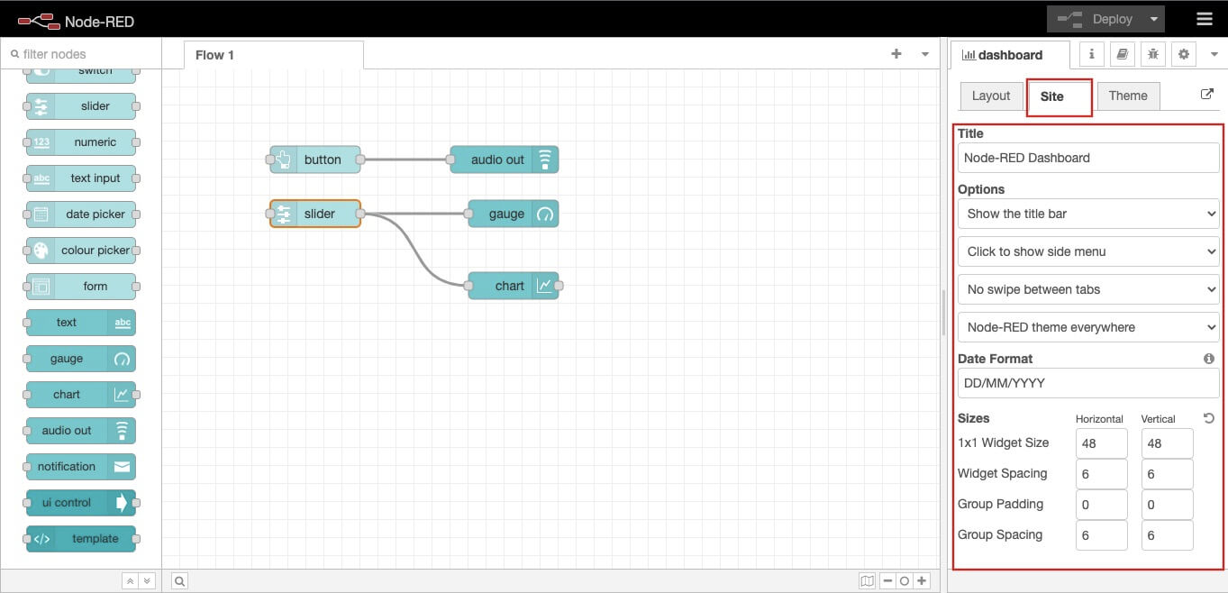
On the main page in Node-RED, as seen below, there’s a site tab that provides more setting options on how you want your dashboard to look. You can edit things like the dashboard Title, Widget Spacing between elements on the same tabs, Date Format, and a lot more. Go ahead and try out some things to see how they’ll look on the page. Don’t forget to deploy your changes!

Wrapping up Node-RED dashboard
The aim of this guide was to provide basic knowledge of how the Node-RED dashboard works on Raspberry Pi. I believe with all the examples we covered in this post, you should have an idea of the next thing you want to do with the Node-RED dashboard in your journey to an automated life.
