7 Best Practices for Data Visualization
By
Charles Mahler /
Use Cases
Feb 23, 2023
Navigate to:
This article was originally published in The New Stack and is reposted here with permission.
A look at best practices, no-code and low-code platforms you can use, common visualization types, criteria for good data visualization and more.
Organizations regularly generate an overabundance of data that is essential for decision-making. Data visualizations play an important role in helping people understand complex data and observe patterns and trends over a period of time. Data visualization is an important skill for data professionals, which usually goes hand in hand with storytelling, aiming to communicate observations effectively and inform decisions.
In this post, we’ll discuss what data visualization is, goals for visualizations, best practices, no-code and low-code platforms you can use, common visualization types, criteria for good data visualization and how to judge data visualization.
What is data visualization?
Simply put, data visualization is the process of translating data into easily understood visuals. These visuals could be in the form of graphs, charts, maps, plots, animations and others.
It’s important to set goals and objectives when creating data visualizations.
What are the main goals of data visualization?
It’s important to set goals and objectives when creating data visualizations. Here are a few to consider when putting together your own data visualizations:
- Data visualizations are useful for highlighting trends, patterns and correlations in data.
- Data visualization is an effective decision-making tool that enables key individuals to make well-informed decisions backed by data.
- Data visualizations make it easier to make sense of large datasets and combine different datasets from various sources.
- It’s an effective way of using storytelling to communicate data-backed ideas.
- Data visualizations need to hold the target audience’s attention while being easy to understand and interpret.
- Data visualizations make it easier to monitor important metrics and keep an eye on key performance indicators (KPIs).
Best practices for data visualization
Here are a few best practices to keep in mind when creating visualizations.
1. Have a goal in mind
When creating data visualizations, first understand the type of data you’re working with and have an idea of the type of insights you’d like to derive from them. Keep in mind the information you want to communicate, its importance and the audience you are presenting to.
2. Choose the right visualization tool
After setting goals for your visualization, consider the right tools to help you present your data. There are code libraries and no-code/low-code platforms, depending on the use case, and they each have their own strengths.
No-code/low-code platforms
With little to no knowledge of how to code, you can create engaging data visualizations that capture the message you’re trying to communicate. Here are a few popular visualization platforms that can enable you to create visualizations, dashboards and reports:
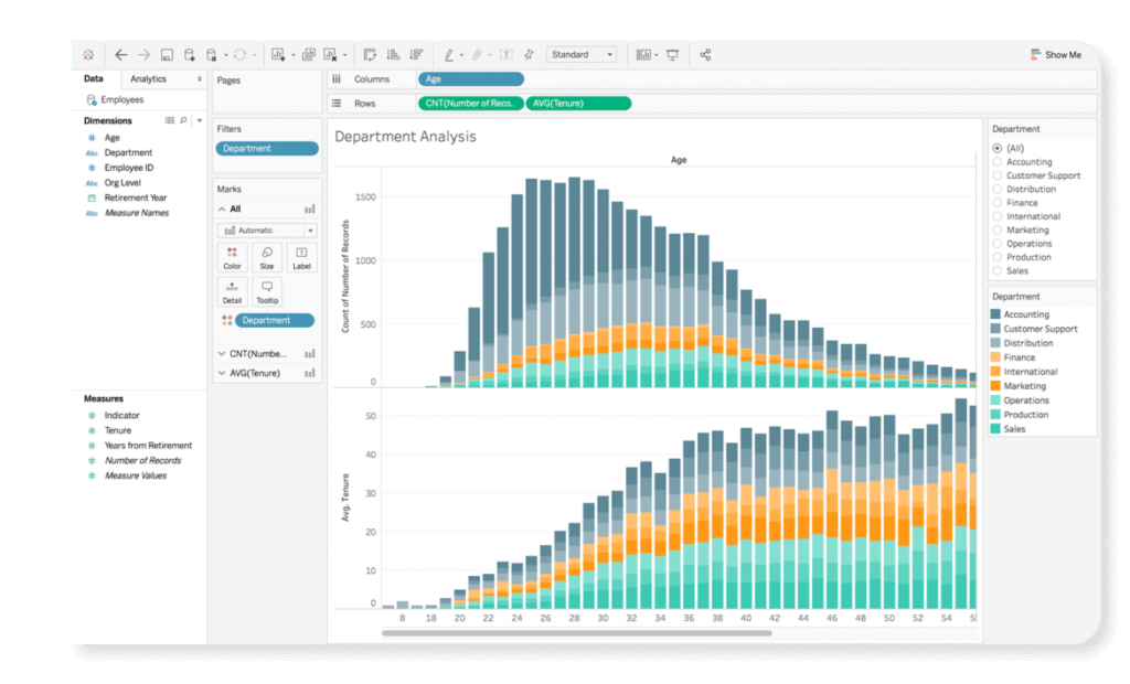
- Tableau: Tableau is a visual analytics platform that enables users to create interactive charts, maps and dashboards. The effortless drag-and-drop functionality of the platform enables users to quickly create interactive visualizations with a wide range of charts, graph and interactive elements, while also enabling users to integrate programming languages such as Python and R.
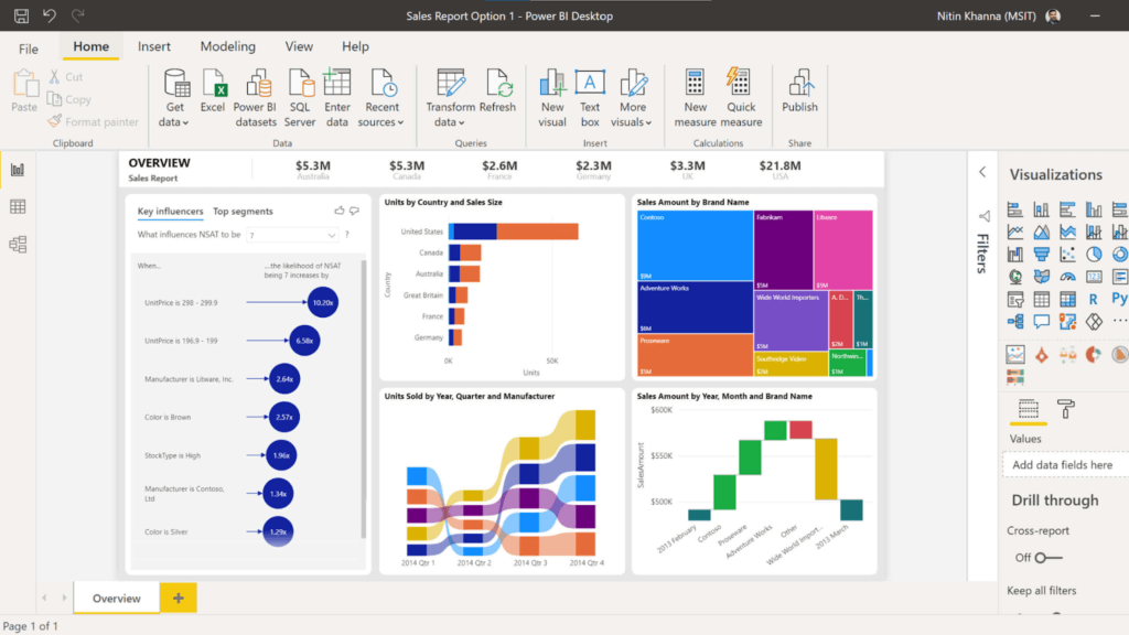
- Power BI: Power BI is a popular business intelligence platform that allows professionals to create interactive dashboards, charts and graphs, offering a wide range of options and interactive elements while being user-friendly and intuitive.
- Looker Studio (formerly Google Data Studio): Looker Studio is a platform that allows users to create customizable dashboards and reports. It provides users with an effective option to create professional-quality visualizations for free and without the need to write code.
Data visualization libraries
On the other hand, depending on the use case, you can use code to create data visualizations. For visualizations, you can build and use packages created in JavaScript, Python and R.
Python
Python is a versatile programming language used extensively for data science and machine learning. Several data visualization libraries are in Python, and you can select libraries depending on your project’s needs.
Here are a few of the most widely used libraries in Python:
JavaScript
JavaScript is a popular programming language used to build web applications and interactive elements on websites and create data visualizations. A few popular libraries for creating visualizations are as follows:
R
R is a programming language and software environment used for statistical computing and visualizations. With R, you’ll have access to several libraries and packages for creating a wide range of visualizations, including simple plots and interactive graphics.
Here are a few widely used R packages for data visualizations:
3. Choose the right type of visualization
Picking the right type of visualization can greatly improve clarity and readability, and ensure your visualizations are engaging. When using these visualizations, ensure that you make wise comparisons and use charts well-suited for the data type. The right visualization depends on your goals, data type and audience.
Here are some charts and what they’re most useful for:
- Bar charts: Bar charts are graphs with rectangular bars used for creating visuals for categorical data. They are useful for showing distributions and are commonly used as they’re a quick way of communicating information and comparing values.
- Line graphs: Line graphs use lines to connect different data points. They’re helpful when creating a graph that presents trends and patterns in data, such as time series data. Some examples are changes in weather, stock prices, sales, etc.
- Scatter plots: Scatter plots show relationships between variables and are helpful when representing how variables influence each other or identifying data patterns.
- Pie charts: Pie charts are simple, effective charts that use a circular diagram, with each portion of the pie representing the relative size of the data. They’re used to show how a quantity or percentage is distributed, or has changed over time, by using multiple charts to represent different time periods.
- Box plots (or box and whisker plots): Box plots are graphs used to present the minimum, maximum, median, first quartile and third quartile of a dataset. They’re especially useful for seeing the overall shape of your dataset and pointing out outliers.
- Violin plots: Violin plots are similar to box plots and are used to visualize the distribution of a dataset. They can be used to show a dataset’s minimum, maximum, median, and quartiles and the distribution of the data using kernel density plots. You can use them to compare data distribution between different groups or to identify outliers in data.
- Heatmaps: Heatmaps are colored matrices used to present data values; darker colors are used to represent high values, while cooler colors represent lower values. Heatmaps are useful for identifying noteworthy variations in data as well as pointing out patterns and trends.
Examples
Let’s create a few data visualization examples with code using popular Python libraries:
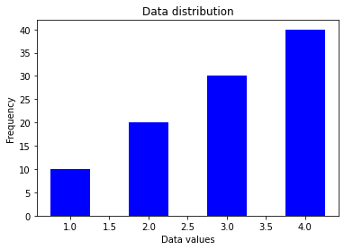
- Bar charts: Here, we’ll create a bar chart using the values in x for the data values axis and the values in y for the frequency axis. Create a bar chart with Matplotlib using the bar() function.
import matplotlib.pyplot as plt

# Data to plot
x = [1, 2, 3, 4]
y = [10, 20, 30, 40]

# Create the bar chart
plt.bar(x, y, width=0.5, color='b')

# Add labels and title
plt.xlabel('Data values')
plt.ylabel('Frequency')
plt.title('Data distribution')

# Show the plot
plt.show()
Your results should look like this:
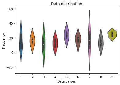
- Violin plots: Let’s use Seaborn to create a violin plot with generated values for the x and y axes using the violinplot() function.
import seaborn as sns
import numpy as np

# Generate data
x = np.random.randint(1, 10, size=30)
y = np.random.randint(1, 30, size=30)

# Create the violin plot
sns.violinplot(x, y)

# Add labels and title
plt.xlabel('Data values')
plt.ylabel('Frequency')
plt.title('Data distribution')

# Show the plot
plt.show()
Your results should look like this:
- Line graphs: Let’s create a line graph with Bokeh using the line() function and generated values.
from bokeh.plotting import figure, show

from bokeh.io import output_notebook

import numpy as np

# Generate data

x = np.arange(20)

y = np.random.randint(1, 20, size=20)

# Create the line graph

p = figure(title="Line graph", x_axis_label="x", y_axis_label="y")

p.line(x, y)

# Show the plot

output_notebook()

show(p)
Your results should look like this:
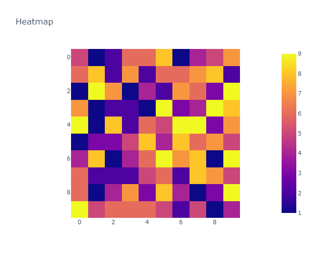
- Heatmaps: Using Plotly, we can create a heatmap using the heatmap() function and random values.
import plotly.express as px
import numpy as np

# Generate data
data = np.random.randint(1, 10, size=(10, 10))

# Create the heatmap
fig = px.imshow(data, title="Heatmap")
fig.show()
Your results should look like this:
You can learn more about data visualization tools here.
4. Use succinct labels and titles
It’s important to use labels and titles for your visualizations and ensure they’re easy to understand. These labels should provide context and inform the reader what the graph is trying to communicate.
Other important practices to keep in mind for titles and labels are using fonts that are easy to read, making sure the fonts are large enough, minding the positioning of your labels and using colors that are also easy to read.
You should also avoid having too many labels close together, which creates clutter and affects the readability of the text, and avoid unnecessary abbreviations; if you need to use abbreviations, include what they mean in a key within the report.
5. Choose the right colors
Colors play an important role in data visualizations as they help keep your audience engaged with the content of your dashboard, or report and draw the audience’s attention to important information you’re trying to point out.
When picking a color scheme, you can choose to stay on brand (for example, using your company’s brand colors) while keeping in mind the readability of your titles, labels, charts, etc. Try not to use too many colors, and ensure your visualizations are appealing. At the same time, you should consider the psychology of color as it influences your audience’s reaction. Finally, consider people with visual impairments when picking color schemes for your visualization.
In essence, stick to a clear and consistent color scheme for your visualizations.
6. Avoid clutter and unnecessary visual elements
A good data visualization is easy to understand, engaging and uncluttered. Having too many things going on at once in your visualization can distract your audience from the insights they’re supposed to take away from your work.
To improve the readability of your visualization, use simple designs and avoid unnecessary elements. Unnecessary elements could be too many labels, distracting background images and patterns, unnecessary data points or gridlines that aren’t relevant. Ensure your titles and labels are easy to read and comprehend and make sure there’s adequate spacing between charts and other components. Keep your designs simple and focused on the insights you’re trying to get across.
You’ll need to clean and preprocess your data to ensure it’s free from errors and anomalies.
7. Use data that is clean and up to date
Data quality is very important for visualizations. You’ll need to clean and preprocess your data to ensure it’s free from errors and anomalies. This process may include removing missing or duplicate values, data normalization, etc. Using uncleaned data could result in misinterpretation or incorrect conclusions — not to mention how difficult it is to create effective visualizations with it.
You wouldn’t want to use dirty or outdated information to back decisions in your organization. It’s also important to use the most recent and relevant data available to ensure your visualization is not only current, but accurate.
What are the criteria for good data visualizations?
Now that we know some best practices for creating data visualizations, here are some criteria for creating good data visualizations:
- A good data visualization shows complex data connections in a way that’s easy to understand, clear, concise and without clutter.
- Your audience can quickly grasp the key points you are trying to communicate. Insights should be easily absorbed by your audience.
- The visualizations should effectively communicate the information and ideas in the data using the right visual elements.
- Good data visualizations should consider the needs of various audiences, while being accessible and inclusive by using clear and legible fonts and text sizes. Use appropriate color choices and contrasts. Avoid colors such as red and green, since red-green color blindness is most common.
- A good data visualization is simple and straightforward without unnecessary distractions or elements.
- Good data visualizations are based on accurate, current and reliable data.
What is the best data visualization?
The best data visualization efficiently conveys the message you’re trying to communicate. It considers the type of data involved and presents the data in a way that’s easy to understand and interpret. It also considers design, readability and ease of comprehension.
How to judge a good data visualization
Here are some criteria to consider when judging whether a data visualization is good:
- Assess the visualization’s use of color, labels and other design elements.
- Are the texts readable and easy to understand, and do they provide adequate information?
- Does it help your target audience understand the data and how to use it?
- Are all the contents of the dashboard/visualization in accurate proportions?
- Are the contents of the visualization legible for people with visual impairments?
- Is the visualization easy to understand, uncluttered and engaging?
- Do the colors in the visualization highlight key patterns?
Conclusion
Data visualizations are key to observing and tracking metrics and KPIs in your organization. Following the best practices for putting together a data visualization will ensure you create reports that are easy to understand and helpful when pointing out patterns or anomalies. You can also check out this post on best practices for dashboard design.
InfluxDB is a great platform for visualizing your data, monitoring important metrics and enabling you to leverage your time series data using our intuitive dashboards, queries, tasks and other essential features you need to get deep insights and analytics.
